Evolving our dashboard to accommodate new user demands
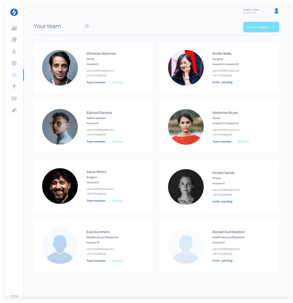
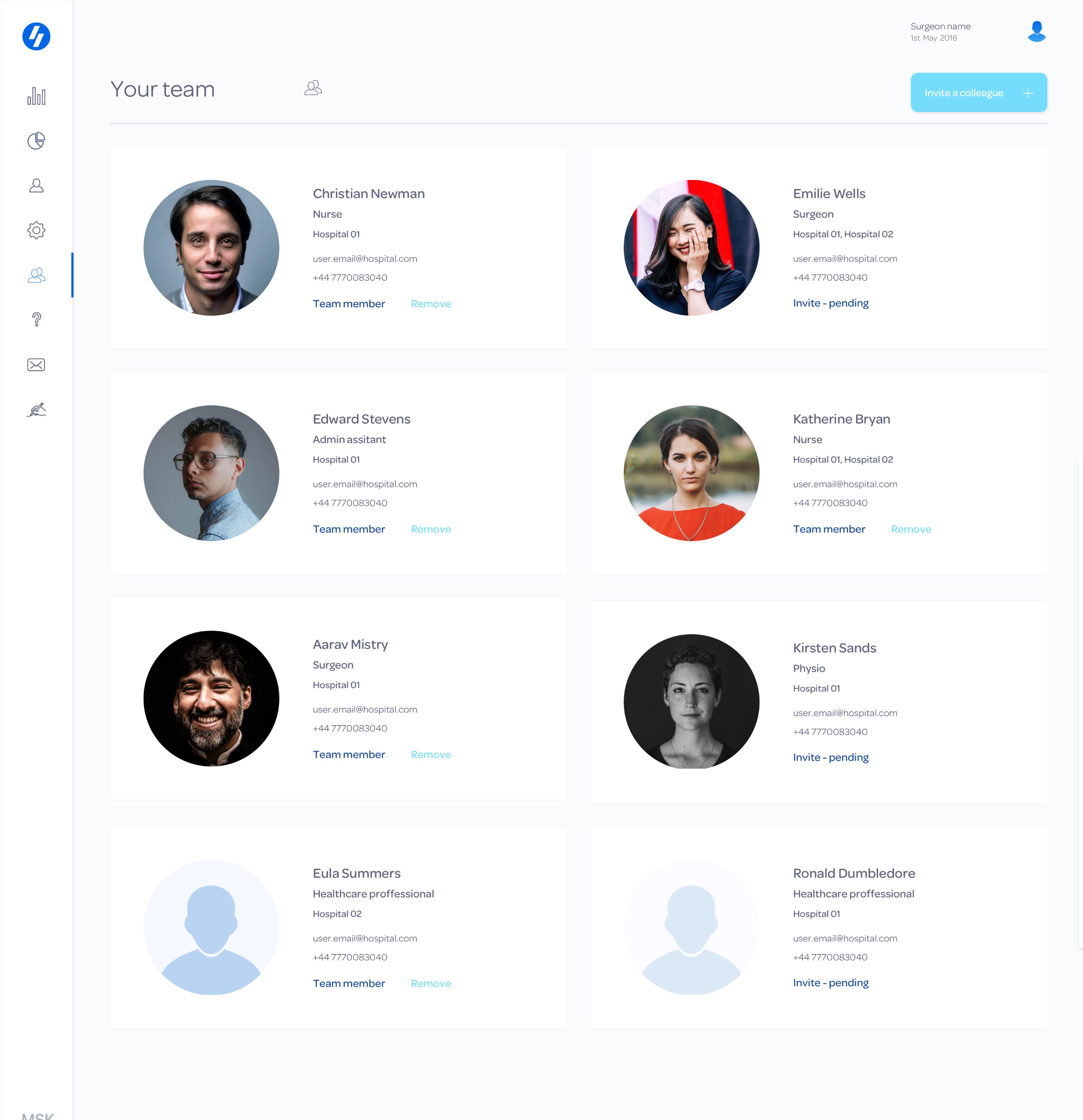
Our original dashboard and app products all centered around supporting orthopedic surgeons, their admin assistants, and their patients. However we began to expand to accommodate clients at hospital level across varying specialties as well as implant companies. Whilst working in close collaboration with our partnership and technical team we undertook a series of exercises to identify the key ways we needed to adjust our current product offering, to support these new users.
Fast facts
Role:
Lead product designer
Deliverables:
UX,UI
Team: Commercial partnership team, myself and developers
Client workshop
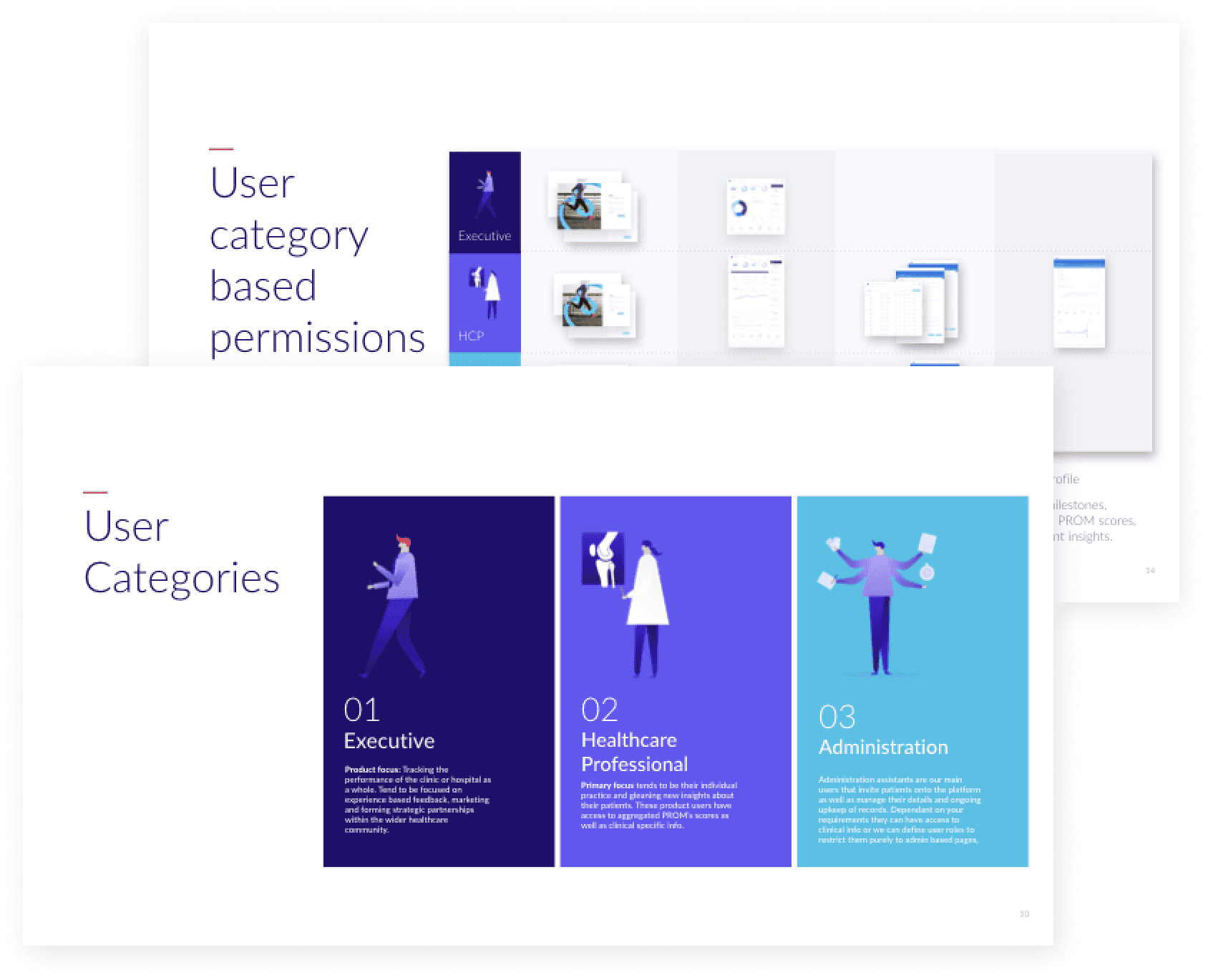
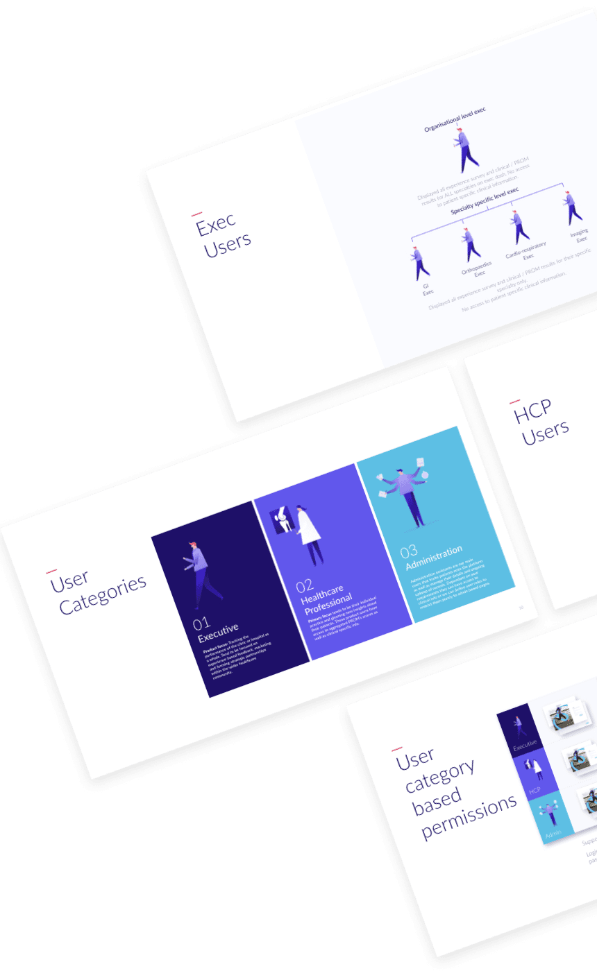
Client workshops were a great way for us to gain an understanding of staff organisation and their roles and responsibilities. This enabled us to suggest key ways that our product could flex to support them with their needs. From this exercise two key design challenges reared their heads around the themes of onboarding and insights.
User testing
Liberating our onboarding process
Our existing model was very manual and relied on one of our staff members having direct contact with the user being added to the platform. With our new business model, this direct contact was not something we would have, but more importantly, this onboarding process was too slow, outdated, and likely to cause an issue for both us and our users. To remove this potential issue we investigated ways to support onboarding that were scalable, multilingual and automated.
Onboarding solution 01
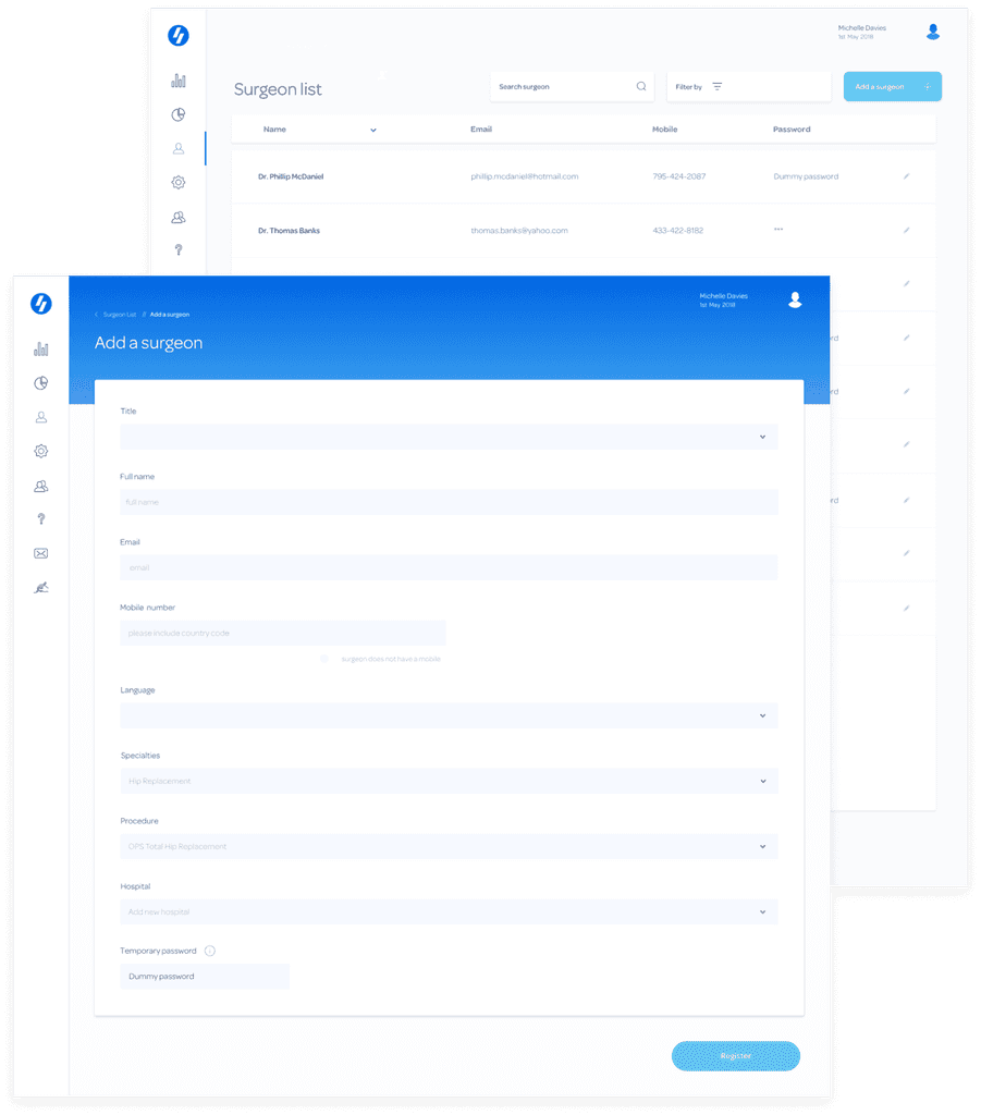
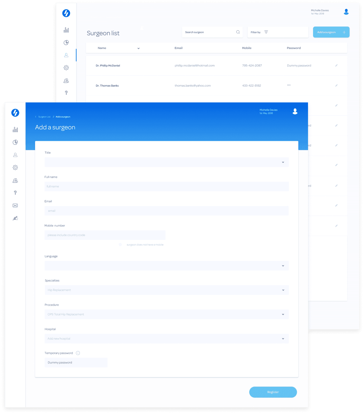
The add a surgeon feature was born
By standardising the questions and information required from each surgeon, we were able to adjust the onboarding process from informal conversations and multiple emails to one simple form. To reduce the tax on the user further we included form fields with pre-populated drop downs. In addition to this, curated logic flows also minimised the number of options presented to the users within and supported swift and easy form completion. Another element key to the process was adding multiple surgeons in a single session. By including a 'save and add another' function to each form we were able to facilitate cyclical input. This meant users did not have to reload the 'add a surgeon' functionality each time.
Design challenge 02
How do we ensure the product provides relevant insights?
Thankfully during the workshopping exercise, we uncovered exactly what each user profile was interested in. This enabled us to create an information hierarchy dependant on each users' profile, enabling us to flex our existing dashboard to pre-load each users' primary interest and shuffle secondary interest to the background.
Insight solution 01
With just one click
There were two clear diversions between our users. One group was primarily focused on experiential information, and one on clinical. In our early iterations of the dashboard, experiential results were presented on one chart only and accessed by altering two different levels of filtering. As this was now a primary focus of 50% of our users we liberated this category of data from being hidden behind multiple interactions. By moving it onto our sidebar, nav users could quickly flick between the two types of data, and were now presented with four charts reflecting key experiential insights.
Insight solution 01
Catering for the big and small picture
While some of our users were interested in overarching trends there was also a rallying cry for more fine-grained filtering. Rather than continue to add more and more parameters onto the per chart filtering we created a global page filter. This allowed us to stagger the deep dive filtering, so as not to overwhelm our big picture users with options. It also catered to the demand for fine-grained filtering by region, specialty and implant details.
dev handoff.
Handoff and design system update
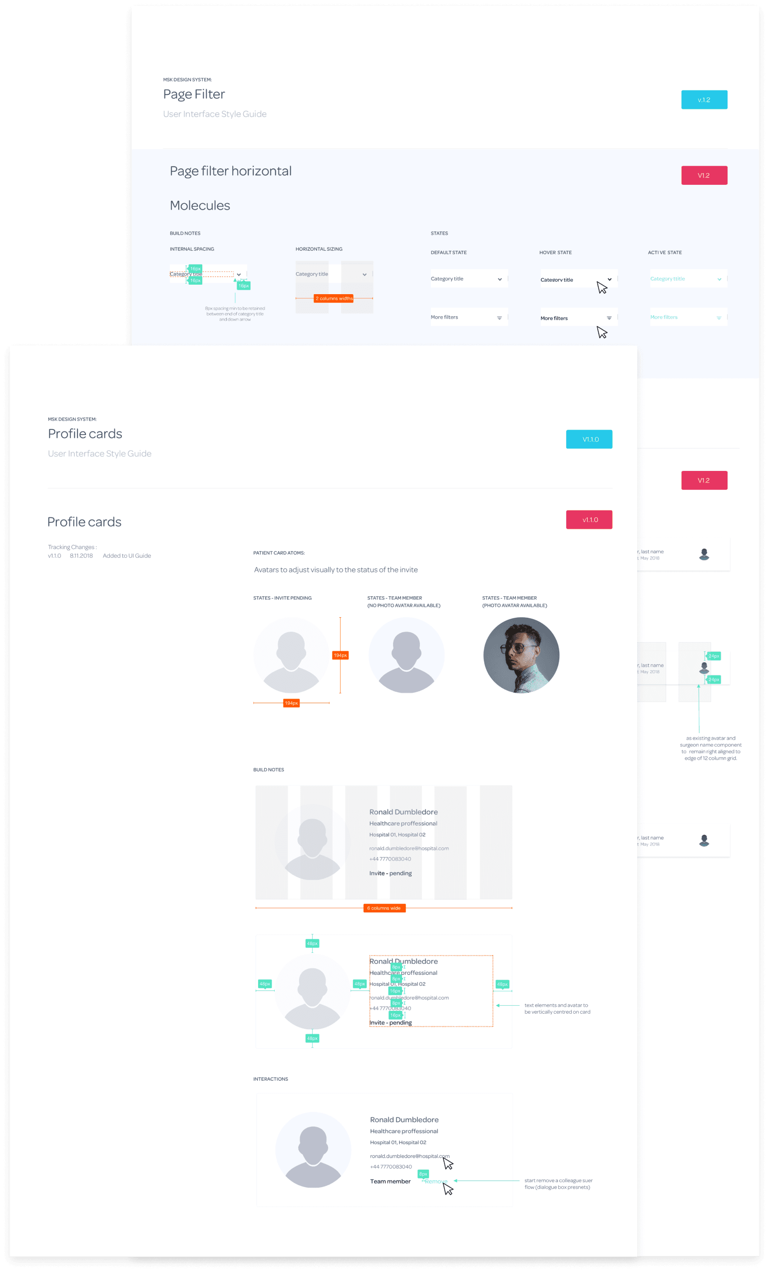
As there were a number of new components created to support these new product features, the last piece of the puzzle was adding them to the UI guides. This process was also an opportunity to ensure each element was created in neatly packaged symbols, ensuring long term efficiency in the design environment. It was also a great way to scenario test our design components, and provide solid behavioral guidance for our devs.
User testing
Other project elements
The evolution of the product was a focus of the design team for a number of months. Also added to the insight elements discussed was the creation of additional charts styles and data visualisation. Other focuses also included under the hood design system updates. This ensured we could implement multiple client brands across the product swiftly, as well as remote support designs with FAQ and help sections.


