Fast facts
Role:
Lead product designer
Deliverables:
Strategy, User interviews, Workshop hosting, department liaison and knowledge share.
Team:
Product manager, and myself.
Year:
2020
Research
What do our customers value?
We understood the friction that not being able to find the right size pot was causing. But what else was important? Through a series of customer interviews we were able to glean other primary drivers for our customers. Allowing us to tailor the shopping experience around 3 primary elements. Size, Colour, and seeing them in combination.
Information Architecture
What does the Patch range support?
We know what our customers value but what can our range support? How can we ensure that browsing our range was friction free and enjoyable. How many options did we have available to them as a maximum and as a minimum and how best to structure this experience?
All the options
40% of our plants had 16 pot options. With a max of 17 on some. This already seemed like too many to present at once and problematic to display nicely on any mobile experience so we quickly ascertained a guided / staged shopping experience would be required.
Colour first shopping
The majority of our customers noted colour as their biggest driver when pot shopping. So we looked into a colour first shopping experience. This however would result in customers at times only being offered 1 pot option, as we may only have 1 yellow pot in our range that would fit a particular plant ( a rather underwhelming experience). We knew from previous experiments that considering at least 3 - 4 options seemed to be a sweet spot with our customers so continued to experiment with ways to present our range.
Style first shopping
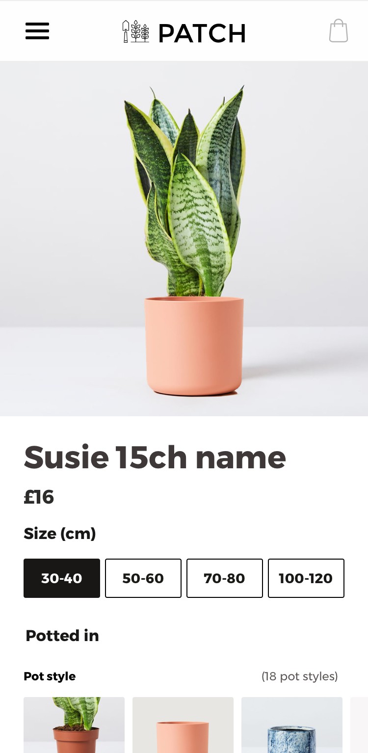
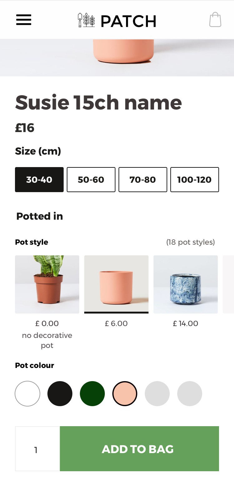
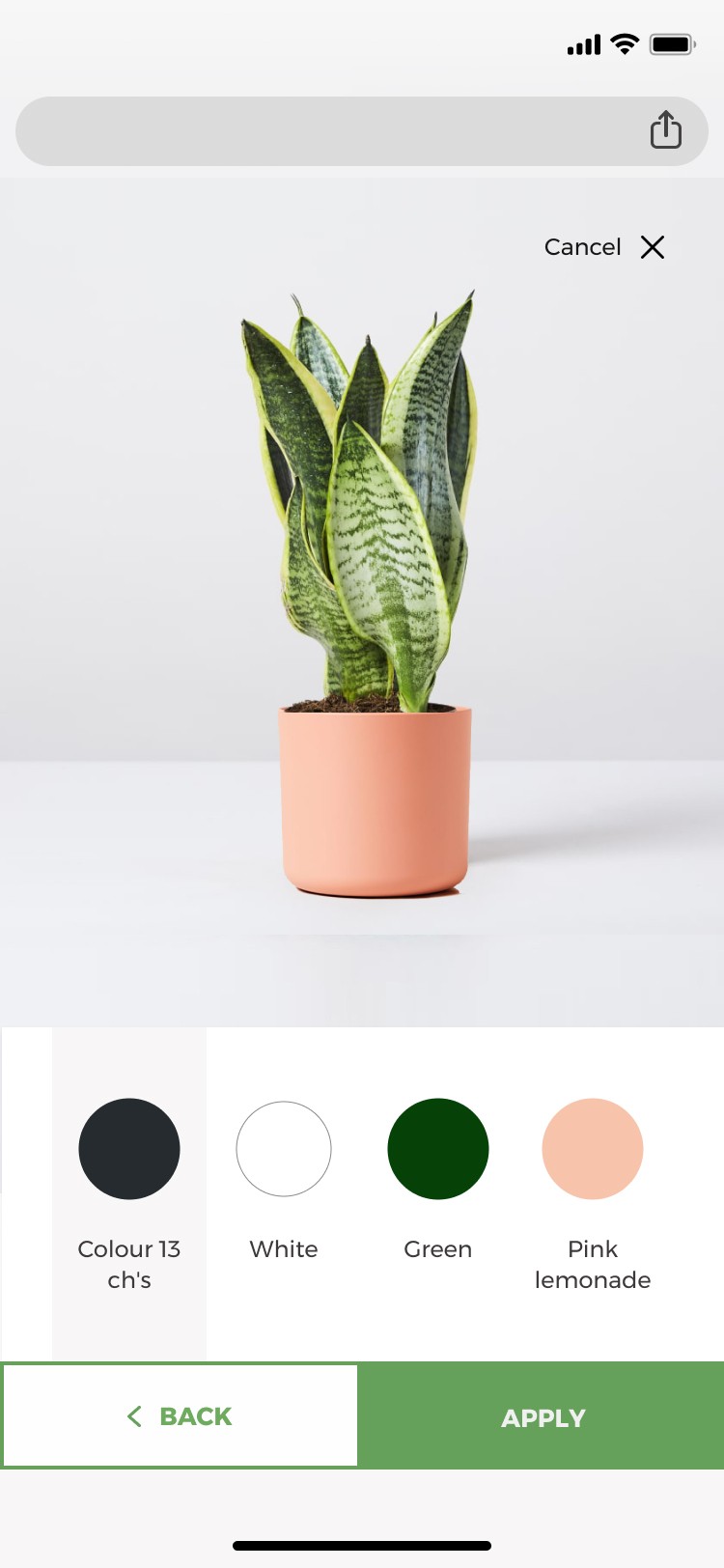
To provide a more satisfying experience we re-ordered the information hierachy to style > colour. This meant that customers always received a range of options, and we felt confident we could give strong indicators of colour through photography or colour chips within the design phases. We had our information hierachy set.
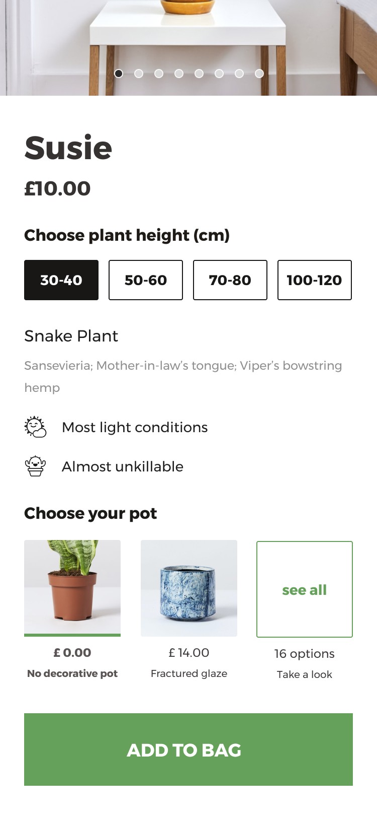
So we knew we wanted a shopping experience that guided customers in place at the time of shopping for a plant. That led them from plant > to pot style > to colour options if relevant. We now needed to find this feature a location that didn’t adversely affect the plant shopping experience.
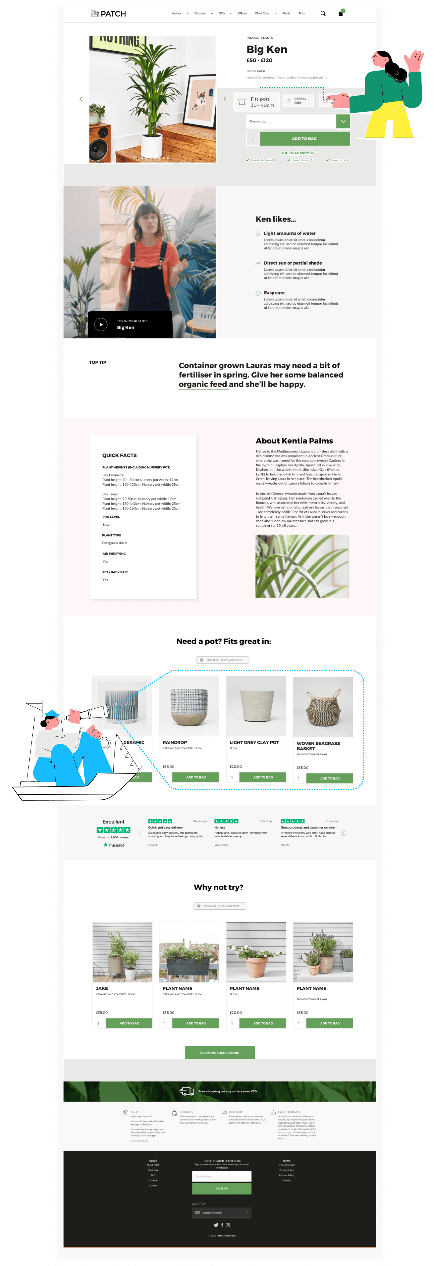
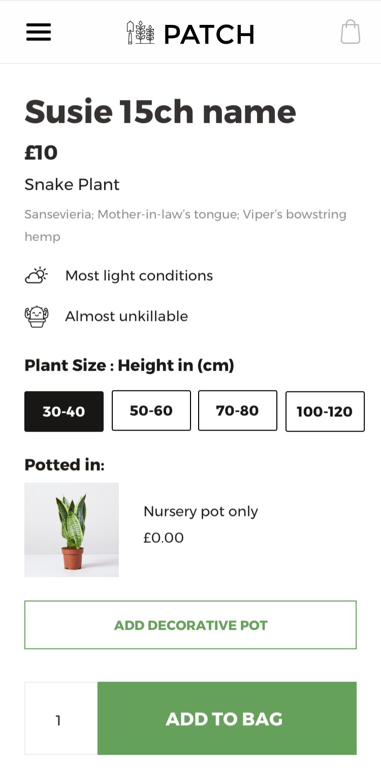
One of the primary issues with our existing feature is that people simply weren’t seeing it. After conducting a small test to migrate our existing pot feature higher up the page we knew that if our customers saw pot suggestions this greatly increased pot purchasing. However in the crude form of dragging and dropping the existing feature we encountered adverse effects to plant shopping.
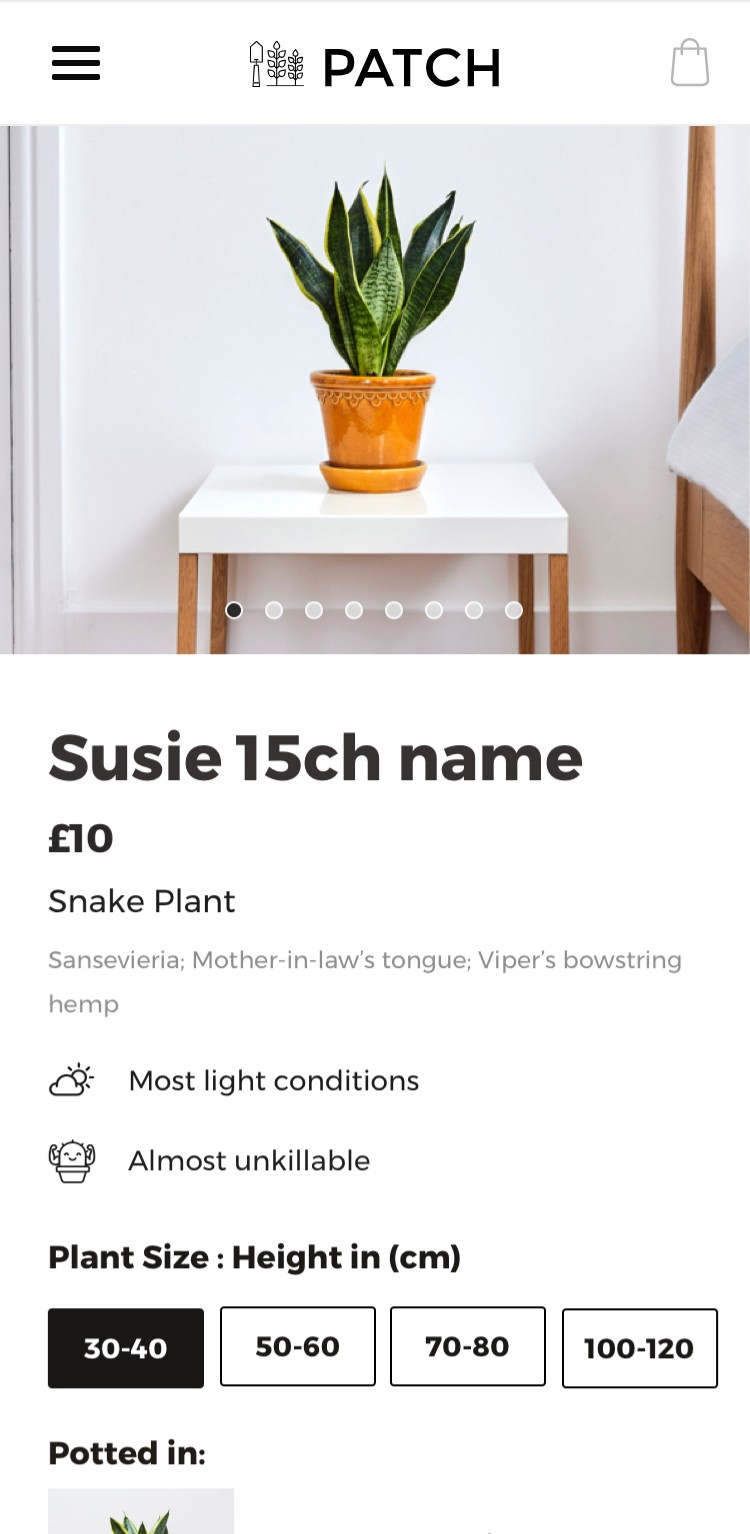
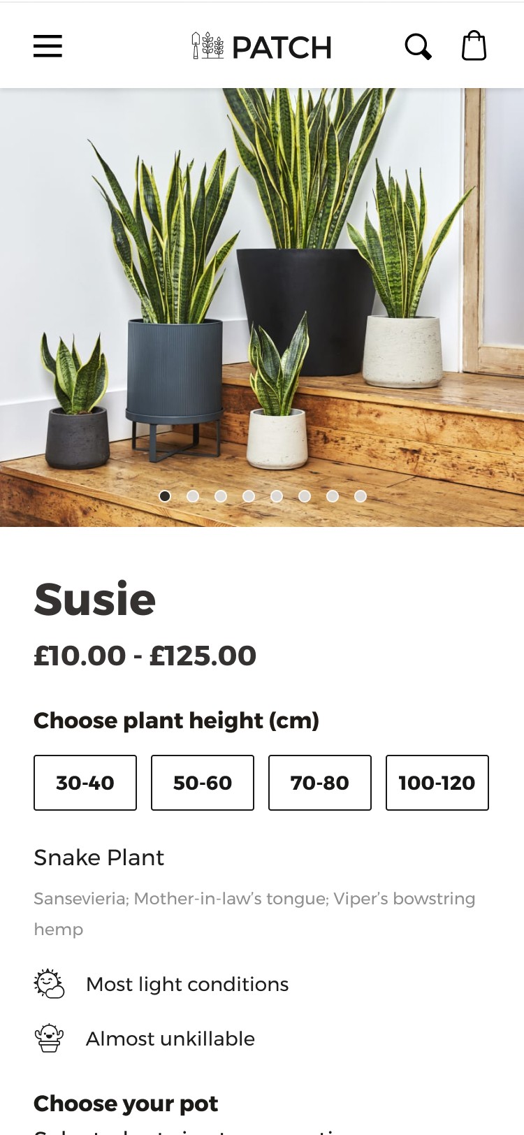
One of the primary issues with our existing design is that people weren’t seeing it. Thus the first location we experimented with was placing the feature directly within the herospace. This was problematic as in order to have any remote chance of users having visual feedback where they would see the pot and plant together in a combo (as desired) . We had to migrate key plant info further down the page. Even with this adjustment users would need to flick up and down the screen to see the pot and plant combo in it’s entirety creating a less than desirable experience. With a huge disruption to plant shopping.
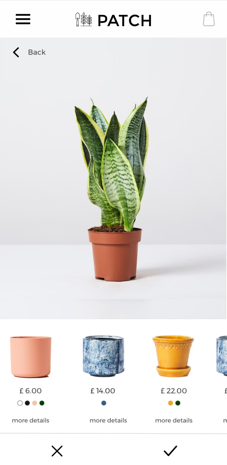
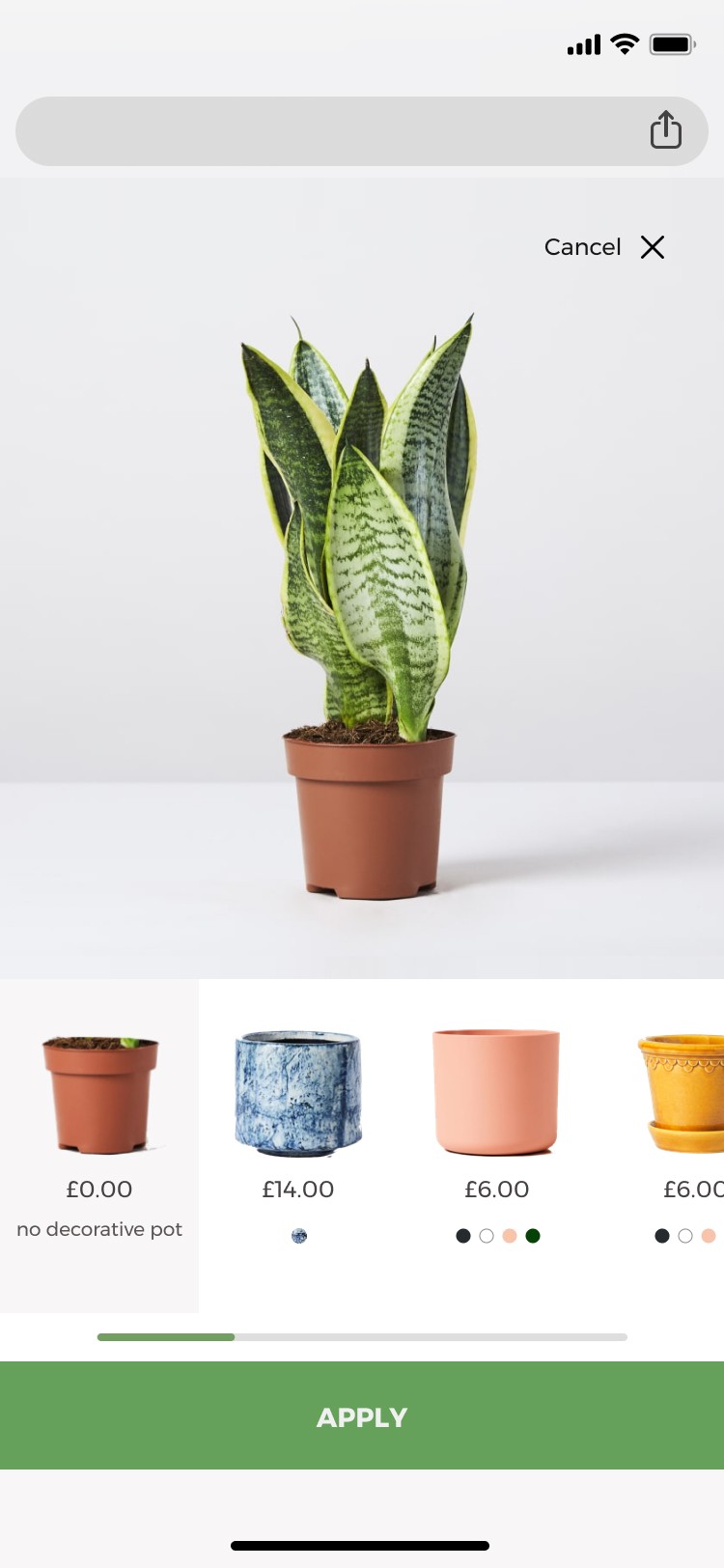
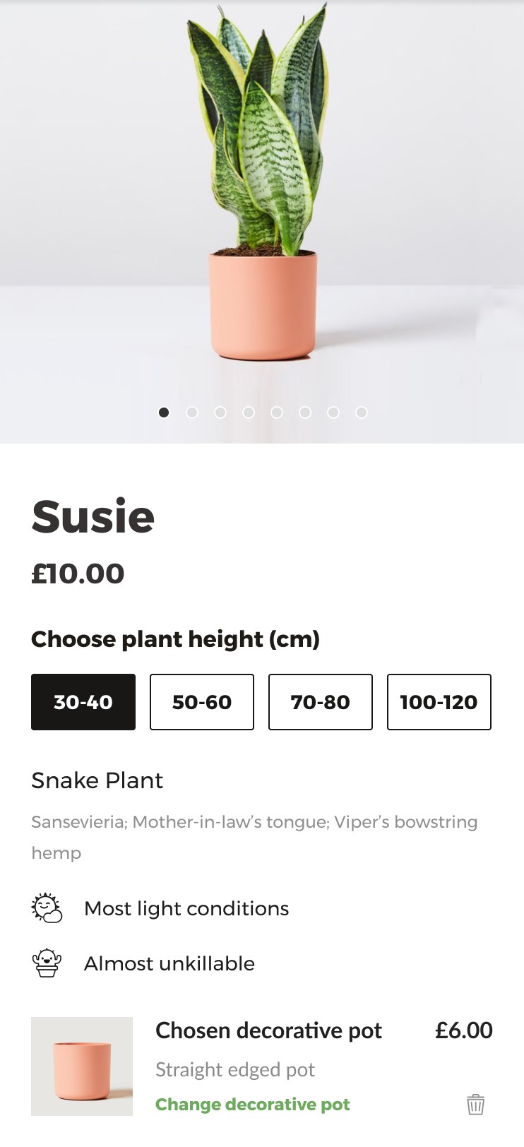
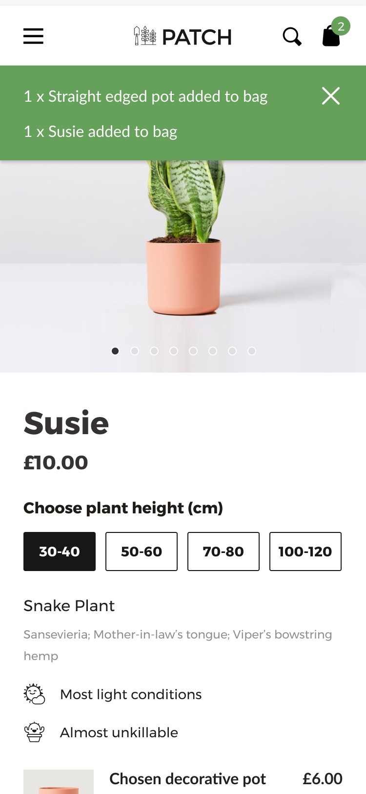
By creating a two stage experience from herospace to full screen curation panel we were able to mitigate the UX issues of the previous option. Guaranteeing full screen viewing for all device sizes and good visual feedback on selections without flicking. We were also able to retain more plant information in place, having less of an impact on plant shopping. We did however like images of the style options shown within the herospace option and felt this would land with our visual browsers well. So opted to include the teaser panel element of the previous option with a full screen curation interface. So we had a design now it was time see what our customers thought.
User testing
So what did our customers think?
By creating a prototype with over 100 screens we were able to thoroughly test this feature prior to build across desktop and mobile. Users navigated into the pot selector easily and enjoyed curating their plant and pot combo.
However there was some confusion around the visual language on the buttons (the tick and the cross) once inside.
A few quick adjustments to not only the colours of the buttons (adding green) but also placement (sticky to bottom of screen) and language ( adding words apply and back on the buttons) we were back out to market with some user testing. We were away. With these small tweaks our customers were flying with no confusion. We were ready for build.
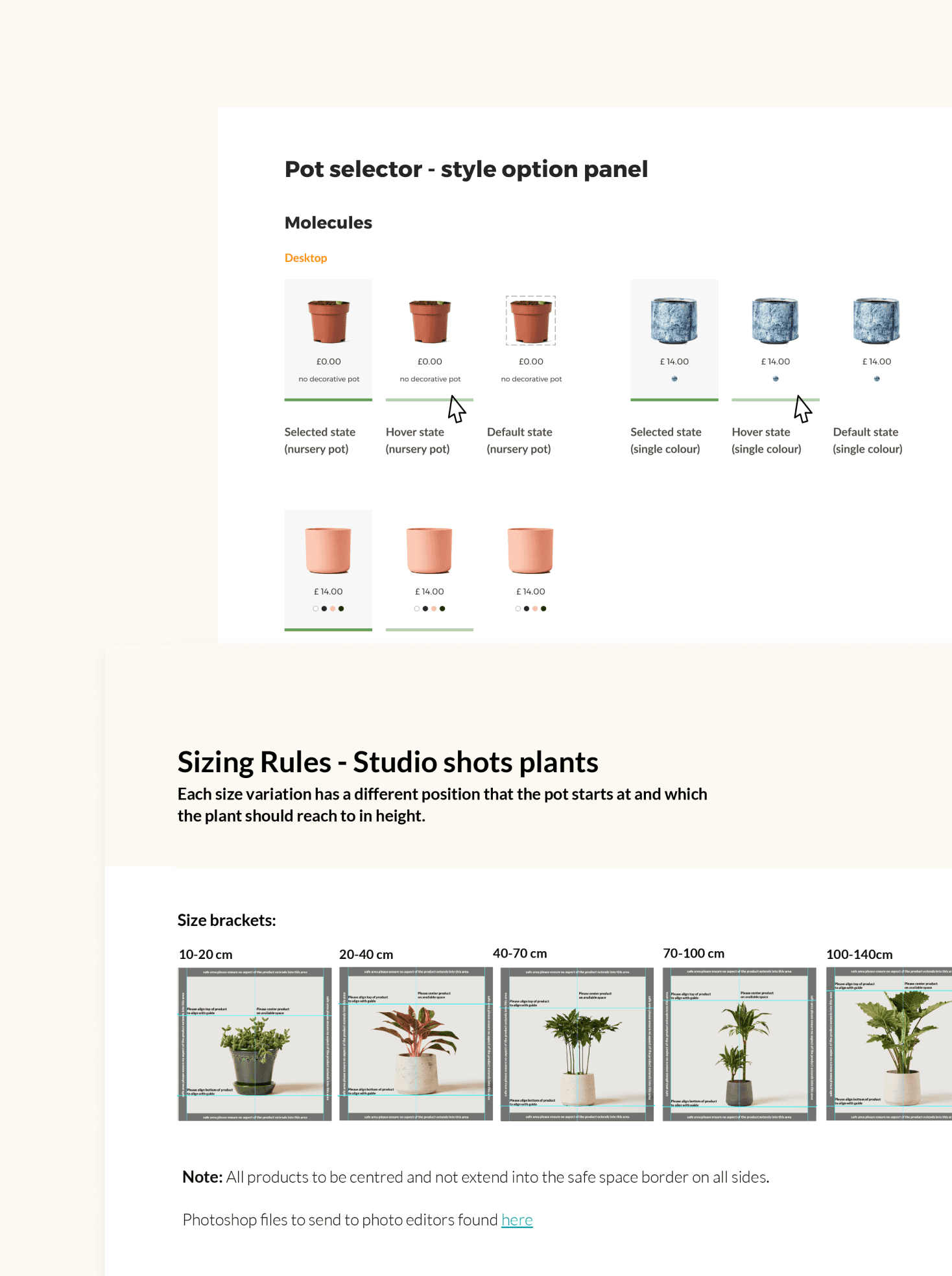
This was a real team effort from Patch. Requiring me to coordinate and collaborate with not only merchandising on shooting the new photography assets required to support this feature. But also external editing teams to ensure they were all sized perfectly for when our development team overlaid them in build. Once the visual assets were perfect we had to design a new back end interface to upload them to the system, and educate the merchandising team how to do this in order to manage the feature ongoing. Finally the UI spec was finalised. Using atomic principles of design each element was documented and circulated for build briefing.
Why I am proud of this project
Managing complexities of the digital and physical products and assets.
I am proud of this project as it involved a high level of collaboration not only across the digital product team on the challenging build elements. But also with the physical product team (merchandising) on pot range and external contractors on photography assets. As a feature this needed to work for our range now and as it flexed. It was satisfying to work through each of these impacts in how it changed our customers experience as well as internal working practice. We also saw fantastic results for our customer and pot purchasing.


